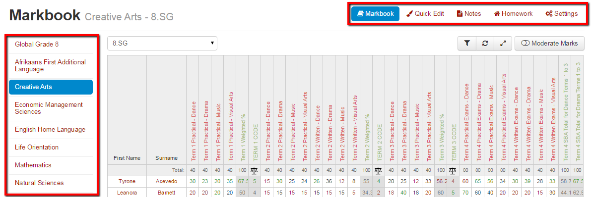
Capture – Markbook Button Locations
We’ve changed the layout of the Markbook buttons to make navigation easier and more intuitive.
Navigation Buttons
- We’ve moved our markbook navigation buttons to the top right
- Course navigation on the left is now included on all markbook screens
These changes will allow you to switch more quickly between markbook, settings, quick edit and other views. They will also allow you to switch courses quicker within each view.
“Add New” and Other Buttons
We have also moved the “Add New” and other buttons related to the markbook page selected. These are now always grouped at the top right of the screen you have selected:
This means you should always expect to find these buttons in the same place.
Can’t see the buttons and screens we’re talking about above?
Staffroom features are controlled by permissions so if you can’t see the buttons and screens we are talking about you may need to talk to your Staffroom Administrator.


